

The “Other” Colors: Grays

Hello Copic readers! In our previous blog, we discussed the “other” Copic colors that aren’t found on a standard color wheel; specifically, the Earth-tones, Grays, Achromatics, and Fluorescents. Today, we’ll be taking a closer look at the 4 different types of Copic Gray and how each of them can be a useful tool in your Copic collection. With that being said, let’s get started by taking a look at the image below!

One of the easiest ways to see the difference between the 4 Copic Grays is by seeing the swatches on paper. Above are the two Copic Color Swatch Cards consisting of the Gray color family. On the top left, the C/Cool colors have an obvious blue under-tone to them, hence the name “cool.” Below that is the N/Neutral grays, and these are some of the most popular Copic grays due to their neutrality (and the 6 pc Copic Sketching grays set). The Neutral grays lean a bit more on the cool side, but not by a lot! This makes them a desirable gray color group due to their ability to look warm or cool, depending on the circumstances. Truly, this color is a neutral. :)
On the top right, we have the T/Toner grays, and at first, these look a lot like the N/Neutrals. However, if you compare three different values side by side, like N3 and T3, N6 and T6, N10 and T10, you’ll see that the Toner colors lean a bit warmer than the Neutrals. So, depending on your marker availability, the Toner grays make a wonderful neutral choice that leans slightly warm.
Finally, on the lower right, we have the W/Warm grays! These grays have a more obvious red under-tone, and thus, have the name “warm.” These are also a very popular choice to contrast against cool grays, and also for artists drawing people and landscapes for the purpose of establishing an ‘underpainting’ or making tonal, compositional sketches.
Let’s take a closer look at the differences between the 4 Copic Grays by watching the short time lapse video below!
Artist: Shannon Brouk

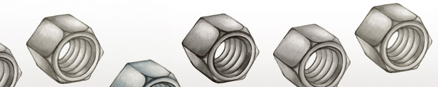
In this video, the artist used the practice sheet found in our line art gallery here to shade a metallic nut using the 4 different Copic Grays, all of similar value - a light gray, two mid-tones, and a darker gray. After swatching each of the colors (making sure they aren’t dry and need refilling), the artist began with the darkest color first for each of the four panels. This is a personal preference, you can definitely start with the lightest color first if starting out with dark feels too intimidating. By starting out with the darkest color, however, it can be faster to color and easier for the lighter ones to blend with the darker ones already on the page/not having to apply as many layers between light and dark to soften the blends.

After applying the darkest color, the artist added the next lightest color, the gray tone ending in either 4 or 5. This darker mid-tone, along with the lighter one coming next, will occupy the majority of the coloring process for this object. Basically, now the artist is trying to fill in the areas of the nut that have a shadow cast on it, with the assumption that the light source is coming from the top/top right corner.

As mentioned above, now the artist is moving on to the next lightest color, the lighter mid-tone gray ending in 3. This lighter mid-tone will fill nearly all of the rest of the space, leaving but a few small areas for bright highlights.

Now, the final step is to add the lightest color, ending in 1. This final color is to add contrast and give off the metallic glow that this tool naturally emits when light shines on it.

And with that, we have our completed color exercise sheet! From the scanned image above, it is clear to see the differences between all four Copic Grays. Each of them has great blending capabilities - choosing which one is “right” for you depends on your personal preferences and, of course, what subject matter you like to illustrate.
Personally, my favorite is the often overlooked T/Toner grays. I find them to be very useful in my sketchbook, being able to look either cool or warm, depending on the rest of the colors in my drawing. However, try out each of the Copic Grays yourself to determine which one you like most!
Personally, my favorite is the often overlooked T/Toner grays. I find them to be very useful in my sketchbook, being able to look either cool or warm, depending on the rest of the colors in my drawing. However, try out each of the Copic Grays yourself to determine which one you like most!

Also, please download the above template here in our line art gallery if you’d like to give this coloring exercise a try yourself!
—
And with that, we wrap up today’s blog! Stay tuned for next month, where we’ll go into detail on the Copic Earth-tone color family!
Until then, don’t forget to follow us across our social media channels @copic_official_us, and sign up for exclusive discounts and prizes by joining the Copic Club! One last thing - use #copicwithus or tag us @copic_official_us for a chance to have your drawings featured on our Copic US social media channels and the homepage on our website!
Thank you so much for reading and enjoying Copic markers as much as we do! 😀