Textures, Stone
15-06-2023
Texture Series: How to color textures with Copic markers
Today’s Feature:
How to color 3 different Stone patterns

Hello Copic readers! In our previous blog, we showed how to color 3 different brick patterns. In today’s blog, we’re going to go into detail on how to color another common texture: stone! So, without further ado, let’s get started by gathering our reference images and materials below!

The first thing you’ll want to do before any coloring can happen is find 3 reference images of different stone patterns you like. This can be done online, around your home, at a friend’s home, or around your neighborhood. The important thing to do here is to find variety so you’re not repeating the same pattern but with different colors, or vice versa.
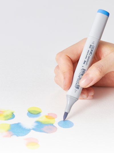
Once your references have been gathered, grab a pencil, eraser, ruler, and a few sheets of marker-friendly paper. We recommend marker paper, or something similar that’s good for layering.

Then, once your photos and materials have been gathered, print either one of the 8.5 x 11 inch templates above from our line art gallery on your sheet of marker paper. If you’re following along to the reference photos you’ve gathered on your own, print the blank template on the left and sketch in each stone pattern lightly with your pencil, using a ruler for precise spacing. If you don’t want to sketch out any stone patterns and would like to only practice your Copic coloring skills, then print the template on the right. That template follows along with the 3 stone images shown at the beginning of the blog.

Now that we’ve found our reference images and drawn (or printed) each stone texture, it’s time to make a color palette! The palette above was made by referring to both the reference images and my personal Copic marker collection. Some marker colors, however, won’t be an exact match to the photos, even if you do have all 358 Copic colors. That’s perfectly fine though! Simply improvise to your personal taste!
For example, the reference photo on the left is flat; there isn’t a lot of contrast, so I added T1, T5, and T7 to make the lights brighter and the darks darker. The same applies to the middle stone pattern, so I decided to use more saturated, contrasting colors. There’s no pressure to exactly replicate your reference photo, they’re called “references” for a reason! Use your artistic license and make any changes to your palette as you see fit.

Now that we’ve gathered our reference photos, have our 3 stone patterns prepared, and our color palettes have been determined, it’s time to get coloring! 🎉
Let’s get started by adding a single layer of the lightest color first (or in the case of the middle pattern, the mortar holding all the stones together). For the top pattern, that’s T1, for the middle, W6, and for the bottom, E31. For the top and bottom patterns, which are both vertically formatted but differ in the amount of detail they have, I colored using the long, flat side of the Medium Broad nib (found in both the Copic Sketch and Ciao markers). It’s also worth pointing out that I applied the first layer of color in the same direction as the pattern: vertically.
For the middle pattern, however, I had an entirely different approach due to the irregular stone shapes. I went ahead and colored in the background area that’s holding all the stones in place so I can make adjustments to the stone colors in case they don’t create enough contrast against it. However, if you’d like to go ahead and start this middle pattern by adding the lightest stone color first (T3), that’s totally fine!
*Note: sometimes the steps in these blogs are done by personal preference to the author, but most of the time they’re made to set the reader up in order for the following steps to work.

Now that our first layer has been added, let’s jump to our darkest color and apply it to the areas where the shadows are in the top and bottom patterns. To determine where the shadows should go, you’ll need to first establish a light source. In the above example, I set my source to the top right, so that’s why the shadows are along the bottom and the left sides of each stone. This may be hard to see due to the intricate top and bottom patterns, but by adding these dark colors, we lay the foundation for the mid-tones and lighter colors to be added on top.
*Tip: Due to the nature of alcohol-based markers (Copics fall under this category), when you layer a lighter color on top of a darker one, it naturally becomes lighter. A similar effect can be achieved with watercolors. Adding more water can lighten any paint by diluting its true pigment. So, if you’re trying to lighten a dark color with Copic, think of adding a lighter color in the same color group on top of it to dilute it. That’s an easy way to create a soft blend!

Now that our darkest color has been added, let’s add the darker mid-tone color by following the same direction of the shadows as the step before. For the top pattern, I added T5; for the bottom pattern, I added E37; and for the middle pattern, I scattered the lightest stone color, T3, across the design.

Next up – you guessed it! – let’s add the lighter mid-tone color. For the top pattern, that’ll be T3, for the bottom pattern, E33, and for the middle pattern, I scattered the second lightest color, YR24, across the stone design.
For the top and bottom stone patterns, you can see the clear division between all 4 colors in each palette, going from darkest to lightest. In order to soften these blends and not make the patterns look “streaky,” we’ll need to add more layers, which leads us to the next step…

…adding another layer of each color to the top and bottom patterns. We recommend at least one more layer of the darkest color, one more layer of each mid-tone, and two more layers of the lightest color to make sure all of the colors blend well together.
For the middle pattern, I added two stone colors in this step: E99 (the dark burnt-orange color) and E59 (the rich dark brown color). Can you see the marker streaks on these dark colors? It’s actually very common to see noticeable marker streaks on Copic colors that end in 5 or above, so this is not surprising. However, to get rid of these streak lines, we’ll need to go over each stone (and the W6 background mortar color) one more time! Which leads us to the final step…

…repeating steps 1-5 (adding another layer of every color: again!) to create more contrast and to soften the blends between each color. By doing this, each pattern should look darker, more realistic, and well-rendered.
Notice how the bottom stone pattern looks a lot darker than the step before. That’s because I decided to cover some of the long, narrow rectangles entirely with E59 so the larger stones could stand out more. I also did that to some of the rectangles on the top pattern as well, but with T5/the second-darkest color. At this point in the coloring process, it’s all about personal preference to get the amount of contrast and look that you want!
Also worth noting is what I did to the middle stone pattern. I added another layer of every color, using the Super Brush nib to color horizontally (because I colored each stone vertically the first time). By coloring in the opposite direction, this helps to get rid of any marker streaks! Furthermore, I decided to add an even darker color, W8, to create the shadows underneath each stone. W8 stands out well against W6, and now the stones look three-dimensional!

That’s a wrap on today’s blog! If you’d like to give it a try yourself, print the above template here on an 8.5 x 11 inch sheet of cardstock or marker paper (one that’s suitable for alcohol-based markers and layering), and put your skills to the test! In addition, once you’ve colored your own version, share it with us on social media using the hashtag #CopicWithUs, or tag us @CopicOfficialUS on any social media platform! We can’t wait to see what you create!

Stay tuned for our next blog, where we’ll be concluding this texture series by going into detail on how you can color 3 different WOOD patterns. Until next time!
Read More Articles
Copic Acrea on Canvas
How to use Acrea on various types of Canvas Hello Copic readers! In our previous blog, we wrapped up our discussion on how to use Acrea o...
The Best Papers for COPIC Acrea
How to Layer with Acrea on Various Types of Paper Hello Copic readers! In our previous blog, we wrapped up our discussion on how to use ...
Copic Acrea with Copic Ink
How can Acrea be used with Copic Ink? Greetings Copic readers! In our previous blog, we discussed how Acrea compares with Copic Multil...

Copic Acrea with Multiliners
How does Acrea compare with Copic Multiliner Pens? Greetings Copic readers! In our previous blog, we discussed how Acrea compares to the ...