Textures, WOOD
30-06-2023
Texture Series: How to color textures with Copic markers
Today’s Feature:
How to color 3 different WOOD patterns

Greetings Copic readers! In our previous blog, we showed how to color 3 different stone patterns. In today’s blog, we’re going to go into detail on how to color our final texture in this mini-series: wood! So, without further ado, let’s get started by gathering our reference images and materials below!

The first thing you’ll want to do before any coloring can occur is find 3 reference images of different wood patterns you like. This can be done online, around your home, at a friend’s home, or around your neighborhood. The important thing to do here is to find variety so you’re not repeating the same pattern but with different colors, or vice versa.
Once your references have been gathered, grab a pencil, eraser, ruler, and a few sheets of marker-friendly paper. We recommend marker paper, or something similar that’s good for layering.

Then, once your photos and materials have been gathered, print either one of the 8.5 x 11 inch templates above from our line art gallery on your sheet of marker paper. If you’re following along to the reference photos you’ve gathered on your own, print the blank template on the left and sketch in each wood pattern lightly with your pencil, using a ruler for precise spacing. If you don’t want to sketch out any wood patterns and would like to only practice your Copic coloring skills, then print the template on the right. That template follows along with the 3 wood images shown at the beginning of the blog.
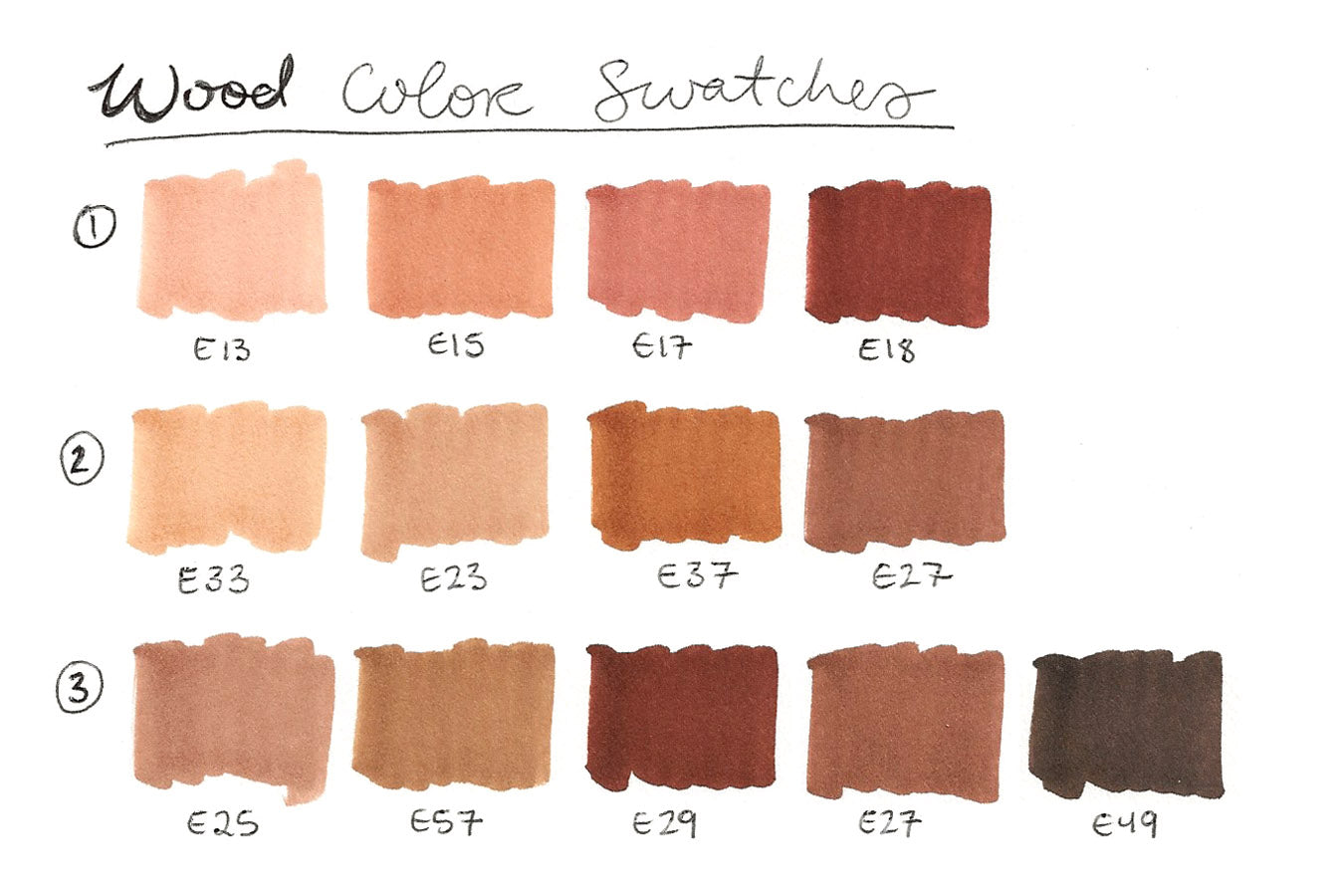
Now that we’ve found our reference images and drawn (or printed) each wood texture, it’s time to make a color palette! The palette above was made by referring to both the reference images and my personal Copic marker collection. Some marker colors, however, won’t be an exact match to the photos, even if you do have all 358 Copic colors. That’s perfectly fine though! Simply improvise to your personal taste!
For example, I wanted to emphasize the red under-tones of the left reference photo, so I made sure the browns I chose were more saturated. I also wanted to make the middle photo darker, and add more contrast to the photo on the right. There’s no pressure to exactly duplicate your reference photo, they’re called “references” for a reason! Use your artistic license and make any changes to your palette as you see fit.

Now that we’ve gathered our reference photos, have our 3 wood patterns prepared, and our color palettes have been determined, it’s time to get coloring! 🎉
Let’s begin by adding a single layer of the lightest color first. For the top pattern, that’s E13, for the middle, E33, and for the bottom, E25. Notice how I colored each of these panels. The top and middle designs were colored horizontally, while the bottom alternates from side to side. This is because I wanted to color with the natural grain of the wood. For a long, horizontal wooden panel, it wouldn’t make sense to color vertically! So be sure to pay attention to the direction of the wood’s natural pattern.
In addition, I colored each of these wood designs using the long, flat side of the Medium Broad nib (found on both the Copic Sketch and Ciao markers). This nib is stiff and perfect for precision, which is exactly what we’re looking for in coloring wood textures!

Now that our first layer has been added, let’s jump to our darkest color using the Super Brush nib! For the top wood pattern, apply E18 to half of each ring, gliding your marker along the curvature of the wood. For the middle pattern, use E27 to add a few curved lines throughout each wood panel. If you’re unsure of how many of these to add, just look back at your reference photo. For the bottom pattern, follow the same technique to apply the curved lines of E29, and outline each diagonal panel with the darkest color, E49.

Now that the darkest color has been added, let’s add the darker mid-tone color! For the top pattern, add E17 right next to E18, filling up the remainder of the wood ring. For the middle pattern, add E37 along and around E27. For the bottom pattern, follow suit to the middle one by adding E27 next to and around E29. On both of these patterns, be sure to leave some space for one more color!
*Tip: for the bottom two wood designs, vary the amount of pressure you apply the Super Brush nib to the paper to achieve a variety of line widths within a single pass. Think of it as using the very tip of the nib and then the side of the nib. The flexibility of the Super Brush allows for great line variation!

Next up – you guessed it! – let’s add the lighter mid-tone color. For the top pattern, add E15 along the edge of E17, leaving only a little bit of the first layer (E13) exposed. For the middle pattern, add E23 to the remaining areas of each wood panel, so that you can only see the lightest color (E33) underneath. For the bottom pattern, follow suit with E57, seeing E25 underneath.
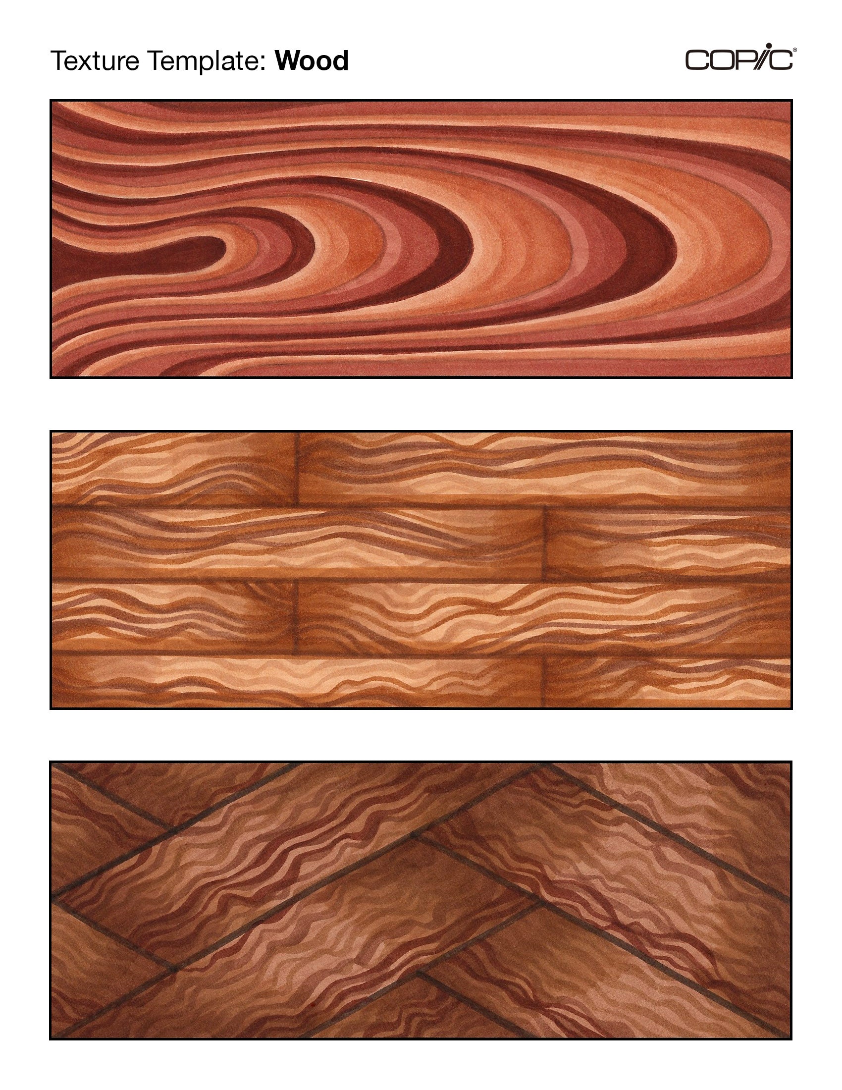
Now that each wood design has been colored with one layer, let’s add more layers to create shadows. In the top design, add another layer of E17, E15, and E13 to further define the ring-shapes in this close-up view of a wood panel. For the middle design, use the Super Brush nib of E33 to go over everything again. This will soften the contrast between all of the different lines drawn onto each panel earlier. Then, use E37 to create shadows along either end of each panel, and the bottom. For the bottom panel, follow the same technique as the middle: fill each panel again with E25, then use a little bit of E29 and E27 to create shadows on both ends of each panel. Wow, these wood textures are looking good!

The final step is to add additional layers to create a maximum amount of contrast. For the top wood pattern, that’s adding another layer of E18, E17, and E15. For the middle pattern, that’s re-tracing over select lines in each panel and emphasizing the shadows on one side only. Lastly, for the bottom pattern, that means re-tracing over the E29 and E27 lines, as well as emphasizing the shadows and divisional lines between each panel with E49.

That’s a wrap on today’s blog! If you’d like to give this lesson a try yourself, print the above template here on an 8.5 x 11 inch sheet of cardstock or marker paper (one that’s suitable for alcohol-based markers and layering), and put your skills to the test! In addition, once you’ve colored your own version, share it with us on social media using the hashtag #CopicWithUs, or tag us @CopicOfficialUS on any social media platform! We can’t wait to see what you create!

Stay tuned for our next blog, where we’ll be showing you how you can apply all of these different textures to drawing a house! Until next time!
Read More Articles
The Best Papers for COPIC Acrea
How to Layer with Acrea on Various Types of Paper Hello Copic readers! In our previous blog, we wrapped up our discussion on how to use ...

Copic Acrea with Copic Ink
How can Acrea be used with Copic Ink? Greetings Copic readers! In our previous blog, we discussed how Acrea compares with Copic Multil...

Copic Acrea with Multiliners
How does Acrea compare with Copic Multiliner Pens? Greetings Copic readers! In our previous blog, we discussed how Acrea compares to the ...

Copic Acrea with Copic Markers
How does Acrea compare with Copic Markers? Hello Copic readers! In our previous blog, we introduced the NEW Copic product; the Acrea pa...