


Copic Ink; Painting Monochromoatic
Copic Ink Series: How to utilize all the features of Copic Ink
Today’s Feature:
How to Create a Monochromatic Painting
Hello Copic readers! In our previous blog, we introduced how to use Copic Ink as a painting medium. In today’s blog, we are going to elaborate on that topic by showing you how to create a fall-inspired monochromatic painting! With that being said, let’s quickly review all of the materials you’ll be needing to get started.
When it comes to painting with alcohol inks, there are quite a few more materials you’ll need besides a piece of paper and some colors. Below is list of the supplies we suggest when making alcohol ink art:
- A glass pane or sheets of cardboard to work on
- Yupo paper, or any other brand of synthetic paper
- Copic Ink colors - 358 to choose from!
- A hairdryer, make sure it has a cool setting
- 91% isopropyl alcohol
- Small (plastic) cups
- Eye-droppers
- Q-Tips
- Paper towels
- Plastic gloves
- A firm-bristled toothbrush
Now that we’ve addressed all of the materials needed for alcohol ink paintings, let’s discuss 3 things you should know before you start:
1. The ink dries FAST!
- If you want to move a lot of ink around your paper, then work quickly; adding some 91% isopropyl alcohol to the page right before you add your Copic Ink color, or right after.
- If you’re timid about moving quickly, no worries! Reactivate the ink with clear 91% isopropyl alcohol and push the ink around with your hair dryer.
2. Be sure you have a good amount of DESK SPACE!
- With a hair-dryer plugged in, and various ink bottles opened around your paper, it’s very easy to cause a spill if you’re working in a tight space (I’ve learned this the hard way!). So, be sure to clear off your desk before getting started!
- Even though Copic markers don’t have a strong alcohol smell to them, pure alcohol ink in a concentrated bottle does. If you can, work by a window with it cracked open. Or, use a small desk fan to be sure you have a constant air-flow. Be sure to drink water and stay hydrated; that also helps!
3. Be prepared with ALL your materials (and plenty of paper towels) BEFORE you start!
- It’s easy to forget something, but the more you have ready before you start painting, the easier the art-making will be!
- This means having paper towels nearby in case of a spill, having plastic gloves on and removing any jewelry, wearing “painting clothes,” and working in a well-ventilated area.

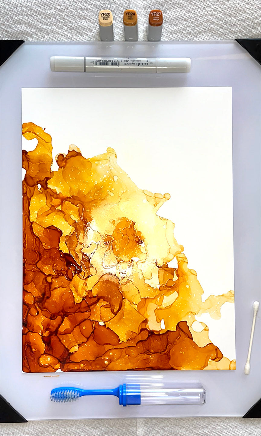
Now that we’ve covered the basics, let’s take a deeper look inside the process behind the timelapse video above. For this particular painting, I used only 3 colors (YR20, YR24, and YR27), on a 9x12 inch sheet of Yupo paper. I prefer to start my paintings with my darkest colors first, in one of the corners. For instance, I started in the lower left corner of this piece and worked my way to the lower right and top left corners. As I continued to add more ink, I blended it with 91% isopropyl alcohol so I was able to push more of the ink around and achieve softer gradients towards the middle of the paper with my very light YR20 color.

Next, working quickly, I added the mid-tone orange (YR24) and the lightest orange (YR20) color in my monochromatic palette. In the screenshot above, I’m in the middle of drying the ink along the left side of the paper, observing how the different colors have interacted and mixed. In my next step, I’ll begin adding more layers of each color, so taking a moment to observe which areas need more color is helpful in moving forward with a successful composition!

Next up, more layers! A common compositional choice that I make in all of my alcohol ink paintings is to leave one corner of the composition white/blank. This gives an area of rest for the eyes in an otherwise busy composition that’s full of blending and overlapping shapes and colors! For that reason, I’ve decided to add more layers to the area that already has ink; making sure to emphasize the lower left corner the most. This area will produce the greatest amount of contrast - especially in the final steps to come!

Above, I’m continuing to add layers of each orange color to get the piece to a spot where it’s ready for the final technique. This means making sure that there’s a soft enough blend of the lightest color, YR20, into the white of the paper.
Notice too in the image above that I’m wearing plastic gloves! These are a huge help in avoiding any accidental ink splashes that could stain both my skin and/or clothes!

The next step is my FAVORITE “finishing touch” technique that I use in all of my alcohol ink paintings: the splatter effect! To copy this technique, dip the bristles of a firm toothbrush into 91% isopropyl alcohol and tap it along the edge of the container to shake off any excess (you don’t want massive dots of pure alcohol splashing on all of your hard work!).
Then, aim the toothbrush bristles at the area on the painting that you want to have small highlights appear (I recommend the darker areas of the painting, such as the lower left corner of this piece). Once you’ve established your target, use your pointer finger and quickly flick the bristles in one swift motion over the area. Voila!
Repeat this as many times as you see fit, but keep in mind the more splatters you add, the less they’ll stand out as a whole.

Now that the splatter effect has been applied, it’s time for me to “clean up” the edges of the piece! This is when I bring out my Q-Tips and bottle of 91% isopropyl alcohol. I dip one end of the Q-Tip into the pure alcohol solution, then quickly apply it to the edge of the areas with YR20/where the alcohol ink stops.
In the above left image, I’m using the Copic 0 Colorless Blender marker to scribble small circles around the area that I want to “erase.” In the above right image, I’m using a Q-Tip dipped in isopropyl alcohol to do the same thing. Both of these tools function as a great “eraser” in alcohol ink paintings, so choose whichever one suits you best! If, however, you use the 0 Colorless Blender Copic marker, be sure to scribble the marker on a blank sheet of paper afterwards to get any of the ink stains off.
And there you have it! The final monochromatic piece is complete!
Before you go; let’s review a few tips:
- Be sure to have plenty of space to work, and that it’s in a well-ventilated area
- Have all of your materials out and ready-to-be-used before any ink hits the paper
- Think of your composition ahead of time. Do you want to leave a corner of the paper white like I did? Or do you want to create a gradient from top to bottom? Or, do you want to fill the entire page? Consider these questions before you get started.
- Work on a glass panel or sheet of cardboard to avoid ink getting onto your desk and permanently staining it (I always use a glass panel for small works like this 9x12 inch piece. Plus, they’re so easy to clean off afterwards with 91% isopropyl alcohol and a paper towel!)

And with that, we wrap up today’s blog on how to use Copic Ink to create a monochromatic painting! Stay tuned for our final blog of 2023, where we’ll be showing you how to create multiple bookmarks out of Copic Ink paintings. Stay tuned!