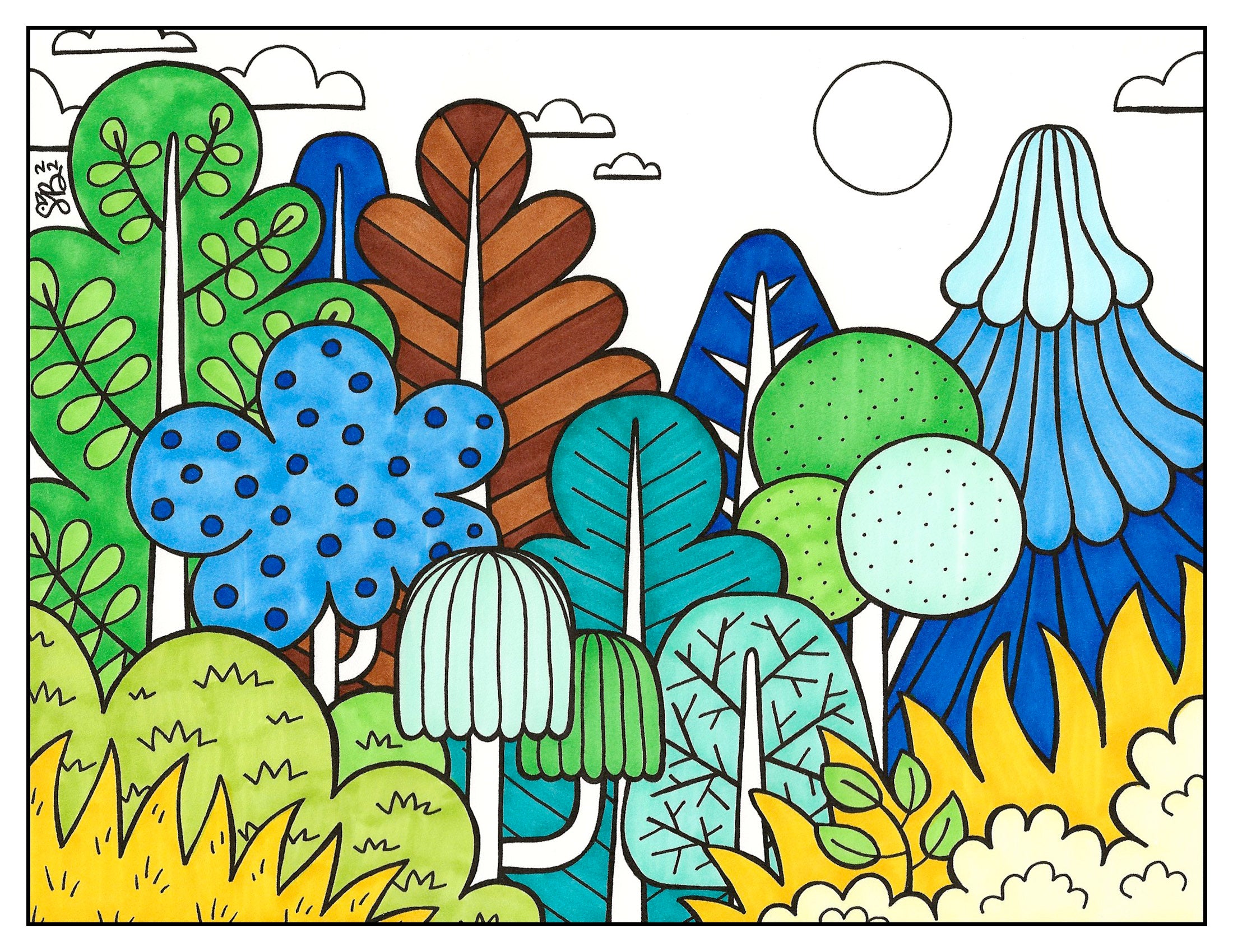
Forest, NATURAL Palette
30-04-2023
Nature Series: How to color a stylized, folk-art inspired forest
Today’s Feature:
Coloring a seasonal forest illustration:
NATURAL palette

Welcome Copic readers! In our previous blog, we showed you how to color a forest illustration by using a summer-themed palette, choosing colors from two different Copic Sketch 6 piece sets (12 colors total). In today’s blog, we’ll be finishing up these color palette lessons by showing you how to color a natural forest by using traditional greens, blues, and browns. So, without further ado, let’s get started by gathering our markers and materials below!

If you’d like to follow along with this blog, you’ll want to print the above 8.5 x 11 inch line art on BOTH a standard sheet of printer paper (for note-taking) AND a sheet of cardstock paper, as well as the Copic Ciao 24 piece set (or whatever greens, blues, and browns you have). That’s all you need! So, let’s get started. 🥳

The first thing we’ll do before coloring in the forest is swatch out our marker colors. We recommend swatching out your colors first using the Ciao Super Brush nib, since this is the nib you’ll most likely be more familiar with and use throughout the coloring process. Swatching your colors may seem like a mundane and meaningless task, BUT by doing this first, it will help with three things:
1. So that you know what the colors will look like with the paper type you’ll be coloring on before applying them to the actual illustration.
2. So you can see if there are any unexpected differences in your colors (for example, a color appears lighter or darker on your marker paper than you expected).
3. To see if any of your markers are dried out! If you do have a dry marker(s), now would be the perfect time to refill them with the corresponding Copic Ink color!
*to shop for Copic Ink, please buy from one of our authorized retailers, find a store near your location using our store locator.

Now that your Ciao palette has been swatched, grab the printed line art on the standard sheet of printer paper and start penciling in the Copic color codes in each plant. I like to call this process creating a value plan, since this is a quick and easy way to figure out how you’ll color the composition (while also making sure that you don’t have a lot of the same colors across multiple shapes). Plus, all this planning can be done without using any of your valuable Copic marker ink!
Notice too how many of the numbers in the front/foreground are lighter colors, like yellows and yellow-greens, while darker colors like blues and browns are in the background. This is because objects in the foreground are closer to you, and thus lighter than those further away (especially since I’ve decided to color this scene at night-time, so the objects in the forest get darker the farther away they are from you and your exploring flashlight!). By making notes, and possibly erasing some to make corrections, this value plan is a great way to work out where colors should go! Which leads us to our next step…

…adding your first layer of color to the large plants! Starting with just these large shapes is a personal preference, as sometimes the notes I take on a value plan end up changing slightly throughout the coloring process. However, now that a good amount of the composition has seen its first layer of color, I can fill in the tree trunks accordingly and make any adjustments.
*Coloring tip: In the scan above, I colored each shape by using the Copic Ciao Super Brush nib, coloring either in small circular motions or up-and-down, depending on the shape of the object/plant. I like to color in the direction of which the shape is going; for example, in the cloud-shaped tree, I colored quickly in a circular, scribble motion. The same technique was applied to the bushes along the left and right sides of the foreground.
However, for the shapes that showed a linear direction, like the green dome-shaped tree in the front and the blue evergreen tree in the back, I colored in long lines, moving my marker nib up and down across each shape until it was completely filled in. Give both of these coloring techniques a try and see if you can spot the differences on your own paper!

The next step after coloring these bushes and trees is to fill in the tree trunks. If there was something you forgot to color earlier, or if you want to make changes from your original value plan, now’s the time to assess and adjust! By working step-by-step, filling in one area at a time (and having a limited color palette, which happens to be a 24 piece set), the once daunting task of figuring out how to color becomes much less stressful!
*Note: Since these tree trunks are all vertical, I colored all of them in an up-and-down direction.

Now that we’ve colored in the tree trunks, the next step is to color the sky! Since I want this forest to be set at night, I chose to color the moon with C3, and the sky 100 Black. Also, since the color of the sky is so dark, I chose to color the clouds with darker colors, like B24, BG09, and B29 so they correspond with the darkness of the night.
Taking what I’ve learned from how I chose to color the fall-themed palette (link to that blog here), if the sky is already pale, leaving the clouds white looks natural. However, if the sky is a dark color, having the clouds bright white creates an unnatural amount of contrast and draws your eyes up to the sky, rather than the boldly colored forest below! Thus, why the mid to dark tones were added to the clouds.
*Tip: Notice the direction of which I colored 100 Black in the sky. I colored it vertically, following the direction of the composition. Since this is only the first layer of 100 Black, I can apply the second layer going left to right, creating an even application of the color in two layers. However, if you don’t like this cross-layered look, you can fill in the sky with small circular scribbles and repeat that technique with another layer once the first has dried.

Now that everything has been colored in one time, the next step is to go over everything with another layer. By doing this, you soften the marker streaks that are visible from the first application of color. Plus, it darkens and enriches the composition, making it look more complete!

The final step after you’ve added a second layer of color (and after you’ve waited for it to dry) is to use the flicking technique with the Super Brush nib to add depth to areas where there would be a shadow. For example, where one part of the foreground overlaps with a plant behind it, like the large trees on either side of the blue cloud-shaped one on the right side of the composition. Extra flicks of YG06, G05, E29, E21, and E37 were added to account for the shadow from the tree. Just by adding these extra flicks of color (the third layer of ink), the composition REALLY pops out and creates a stunning amount of contrast!

Want to give this lesson a shot yourself?! Now that you’ve seen how to color a forest using a natural palette, as well as the other 4 seasons of the year, print the above template here on an 8.5 x 11 sheet of regular printer paper and a thicker cardstock paper (one that’s suitable for alcohol-based markers and layering), and put your coloring skills to the test! Once you’ve colored your own version(s), share it with us on social media using the hashtag #CopicWithUs, or tag us @CopicOfficialUS on any social media platform! We can’t wait to see what YOU create!

That's a wrap on today’s blog! 😊Stay tuned for our next one, where we’ll be starting a new series focusing on three common textures, wood, brick, and stone, and how you can put all of those textures together to draw, outline, and color an exterior of a house! This one you won’t want to miss!
Read More Articles
Writing with Acrea, Pangrams
Greetings Copic readers! In our previous blog, we continued our introduction of writing with the new acrea marker by practicing our curs...

Writing with Acrea, Cursive Letters
Hello Copic readers! In our previous blog, we introduced writing with the new acrea marker by practicing our manuscript letterform...

Writing with Acrea, Manuscript Letters
Greetings Copic readers! In our previous blog, we compared the properties of Copic alcohol markers (Sketch, Ciao and Classic) with Copic...

Using Acrea and Copic Markers Together
Greetings Copic readers! In our previous blog, we compared the properties of Copic alcohol markers (Sketch, Ciao and Classic) with Copic...


