Nature, Coloring Flowers pt. 1
16-08-2022
Nature Series: How to color…
Today’s Feature: Flowers part 1!

In our previous blog, we explained how to draw and outline 12 different flowers. Today, we will be showing how to color 6 of those flowers using your Copic markers: Rose, Marigold, Tulip, Pansy, Sunflower, and Dahlia. Without further ado, let’s get started with the first step below, which is figuring out your color palettes!

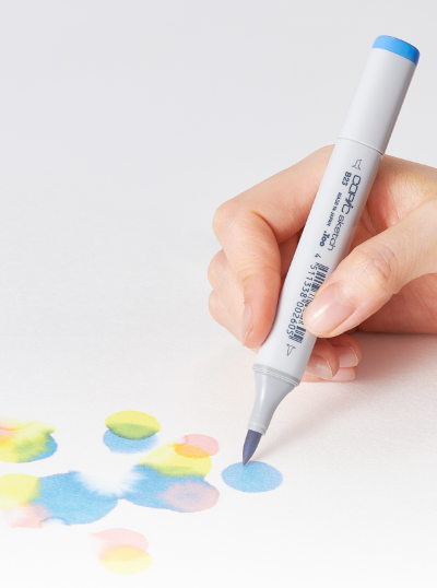
The first step before coloring your subject is to figure out the correct palette! Test your marker colors on a separate sheet of marker paper before finalizing each group. Then, when you feel confident in the colors you’ve selected, swatch them in the rectangles on the flower template in preparation for coloring!

Once the swatching step is complete, we’ll begin coloring each flower, starting with the darkest color first (with the exception of the Pansy: there is a chance I could stain my yellow marker nib with the dark violet, so I’ve added the yellow first). Use the darkest color to add shadows and to “set up” coloring the rest of each flower. Be sure to leave space for the mid-tone and lighter colors as well!

The next step you probably can guess: add the mid-tone color! To make the transition from your darkest color to the mid-tone the smoothest, we recommend overlapping the mid-tone with the darker color/layering directly on top of it. This technique is easiest to see in the Tulip, where I’ve overlapped R17 with R14, picking up a little bit of the darker pigment as I flick the brush upward/towards the area that has the most amount of light hitting the flower. Again, be sure to leave some space for the lightest color coming up next! (with the exception of the Pansy, having the darkest color added last).

This next step uses your lightest color, and each flower should now be fully colored in at this point. Follow the same blending technique as we just mentioned above, overlapping your lightest color with the mid-tone so they can blend more evenly together.
For the Pansy, this step will be the addition of V09, the darkest color, right along the edge of the pale yellow. For these rigid details, hold your Super Brush nib ever-so lightly on the paper. The less pressure you apply, the finer of a point you’ll be able to achieve.

The final step is to add another layer of every color to create more contrast! It’s also the time to add forgotten details or make adjustments, such as the flower stem on the Tulip and the softer gradation on the Pansy petals. If you want to add even more details, use colored pencils on top of your Copic markers to create an even more realistic look!

Apply the lessons learned in today’s blog and practice on the template above, found in our line art gallery! Be sure to download and print this template on good quality paper, as the paper you color on makes a huge difference in how well your final piece turns out!
Read More Articles
Writing with Acrea, Cursive Letters
Hello Copic readers! In our previous blog, we introduced writing with the new acrea marker by practicing our manuscript letterform...

Writing with Acrea, Manuscript Letters
Greetings Copic readers! In our previous blog, we compared the properties of Copic alcohol markers (Sketch, Ciao and Classic) with Copic...

Using Acrea and Copic Markers Together
Greetings Copic readers! In our previous blog, we compared the properties of Copic alcohol markers (Sketch, Ciao and Classic) with Copic...

Copic Sketch vs Acrea
Hello Copic readers! In our previous blog, we showed how to color with the new acrea paint markers on dark, non-white backgrounds. Today...