Nature, coloring TREES pt. 1
15-12-2022
Nature Series: How to color TREES part 1
Today’s Feature: Trees!

In our previous blog, we showed how to draw and outline trees. Today, we will be continuing with the subject of trees by showing part one of how to color them! So, with that being said, let’s grab some green, yellow-red (orange), and earth-tone Copic markers, a few sheets of marker paper, and get started by printing out the template below from our line art gallery!

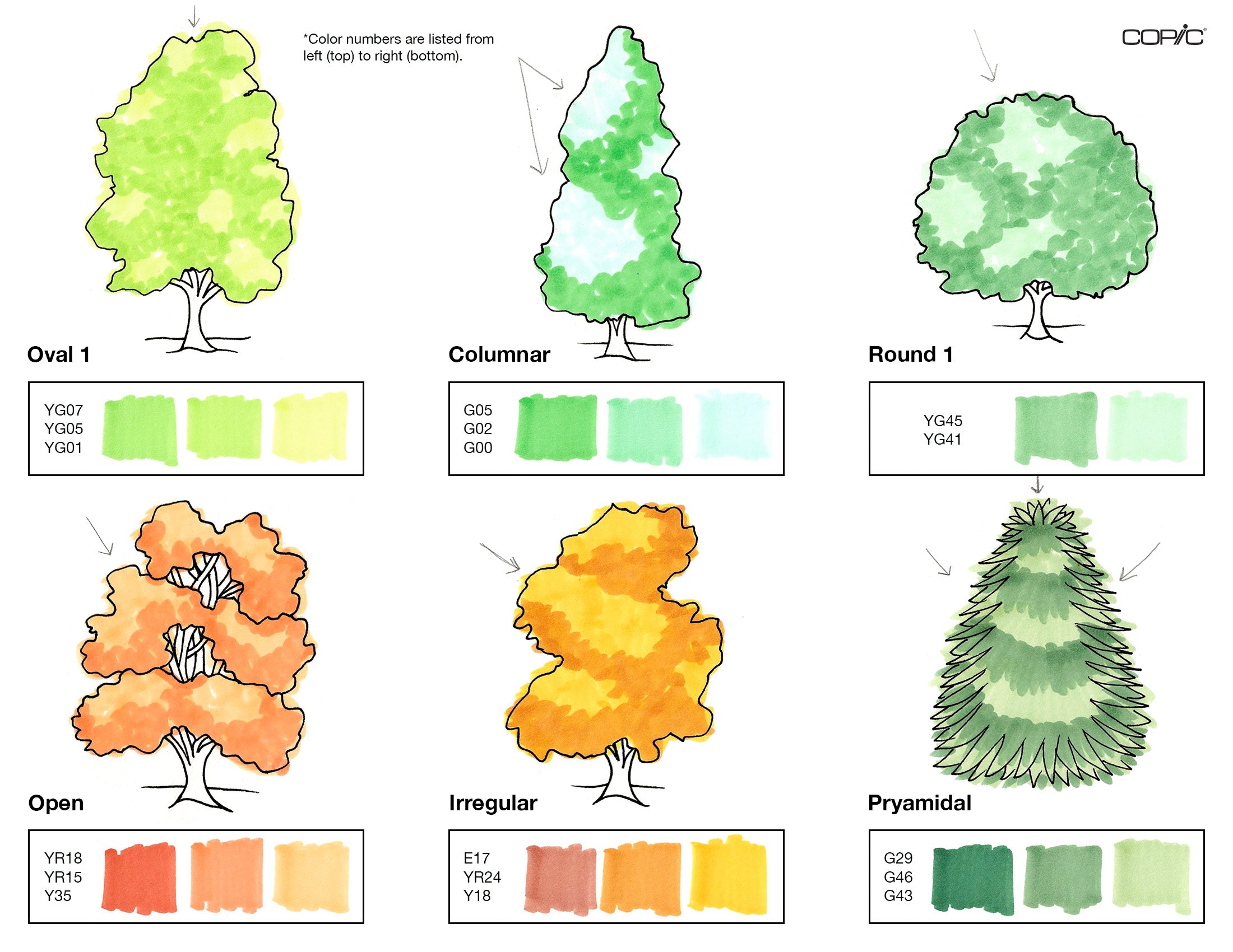
One of the first things you want to do after printing out the template is to make color swatches for each tree. Depending on the time of the year you’re coloring, you can have all of the trees be different shades of green, or you can add autumn colors, like oranges and browns. In the example below, we included a variety of colors, but each tree has one thing in common: they all have a dark, mid-tone, and light color (with the exception of “round 1” having a mid-tone and a light only). The coloring process is much easier when you choose three colors, each in a different value-range!

Once you’ve swatched out your marker colors, the next thing you want to do is add the lightest color over the entire tree shape. What we did below was color in small circular motions due to the nature of trees being an open, airy form. We don’t want the trees looking like they’ve been colored in even lines! So the small squiggles will help create an organic, leafy effect.
*Tip: leave some of the whites of the paper showing in this step! This is only the first layer, and by leaving some of the paper untouched, you can cover it later with a darker color to create an unbalanced, organic texture, which is exactly what we’re going for!

The next thing you want to do after adding your first light-colored layer is to add the mid-tone color in areas where the shadows are casted. In the image below, you’ll see where the shadows were colored by the direction of which the light source is coming from, as indicated by the arrows. So, for example, on the “columnar” tree, the light source that I chose to draw in is coming from the top left side, so the shadows will be on the right side (the opposite of where the light source is coming from).
On this columnar tree as well, working from a reference image (as discussed in our previous blog, where we showed how to draw and outline trees), I continued coloring the shadow slightly above the midsection of the tree, to create division and make the tree look more realistic. If I only added a shadow to the right side in an even way, the tree wouldn't look as natural, so that’s why we added a shadow that draws also to the left.
The next step is – you guessed it! – adding your third and darkest color to the areas where the shadow would be the darkest. Continue to add this final color in small circular motions, or in the case of the “pyramidal” evergreen tree, in small flicks. Once you’ve added the darkest color, there should be a lot of contrast between it and the lightest one! With that being said, we’ll need to smooth out these blends, which brings us to our next step…

…which is using your mid-tone color again to squiggle over the areas where the mid-tone and the darkest color meet. You don’t have to completely cover the darkest color with the mid-tone, but go over it enough so that the two colors react and mix well together.
*Tip: when you’re working in multiple layers with Copic markers, it’s always good to have a sheet of printer paper underneath, or to color on a thicker sheet of cardstock that’s more capable of handling many layers of marker alcohol ink.

The next step is to add another layer of your lightest color! This final layer of the lightest color will soften out the blend between it and the mid-tone, making the tree look full and complete!
Feel free to add soft dots using the tip of your Super Brush nib to create a leafy texture on top of the tree bush you just finished coloring. Also, if any of your coloring goes outside the lines, that’s completely fine! That only adds to the organic look of coloring a tree!
Last but not least, using any earth-tone/brown Copic marker, color in the tree trunks. In the final step below, we used E25. Once the first layer was applied and dried, we added a second layer of E25 along the right side to follow suit of the direction of each light source to create shadows.
If you’d like to also color the grass around each tree, feel free! The grass at the top/where the horizon line is will be lighter, since the sun is reflecting off of it first. It would then fade into a mid-tone and a darker color towards where it meets the tree trunk.

Now that we’ve colored six different trees, share with us your results by using the hashtag #CopicWithUs! Or, if you’ve followed along with this blog and want to give coloring trees a try, print out the template below in our line art gallery (this link was also mentioned at the beginning of the blog) on a sheet of cardstock or marker paper. The paper you color on makes a big difference on the quality of your coloring and layer applications!
Stay tuned for our final blog of 2022, where we will share how to color 6 more types of trees!
Until next time! 😊
Read More Articles
Using Acrea and Copic Markers Together
Greetings Copic readers! In our previous blog, we compared the properties of Copic alcohol markers (Sketch, Ciao and Classic) with Copic...

Copic Sketch vs Acrea
Hello Copic readers! In our previous blog, we showed how to color with the new acrea paint markers on dark, non-white backgrounds. Today...

Copic acrea on Colored Backgrounds
Hello Copic readers! In our previous blog, we showed how to color with the new acrea markers using each of the four 6 pc sets. Today, we...

Acrea, Let's Color!
Hello Copic readers! In our previous blog, we introduced the acrea color range, the four 6 pc sets, and showed 4 ways you can use these...